

7 QC Tools for Quality Improvement with a Strategic Plan
3rd May, 2025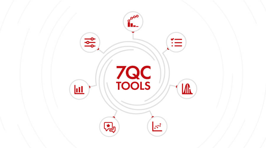
“As much as 95 per cent of all quality-related problems in the factory can be solved with seven fundamental quantitative tools.”
-Kaoru Ishikawa, The inventor of Fishbone Diagram
In today’s customer-centric market, quality is an integral factor in the growth and sustainability of any business. Businesses go the extra mile to provide the best and excellent customer experience to ensure customer satisfaction. Hence, efficient quality management which has the highest impact on customer experience is one of the most essential features for any business.
Introduced by Kaoru Ishikawa, the seven basic tools of quality also known as 7 QC tools are very effective in quality management and quality assurance process. So, businesses who want to ensure competitive and excellent quality of their products and services can utilize the proven 7QC tools for structuring a strategic plan for quality improvement.
In essence, these tools help answer three critical questions:
- What Is Going Wrong?
- Why Is It Happening?
- And How Can We Fix It Effectively And Permanently?
The following sections offer a closer look at each of the 7 qc tools of quality with examples and real-world applications.
Want to implement the 7 QC Tools in your organization? Explore our 7 QC Tools services
.
List of 7 QC Tools For Quality Improvement
Cause and Effect Diagram
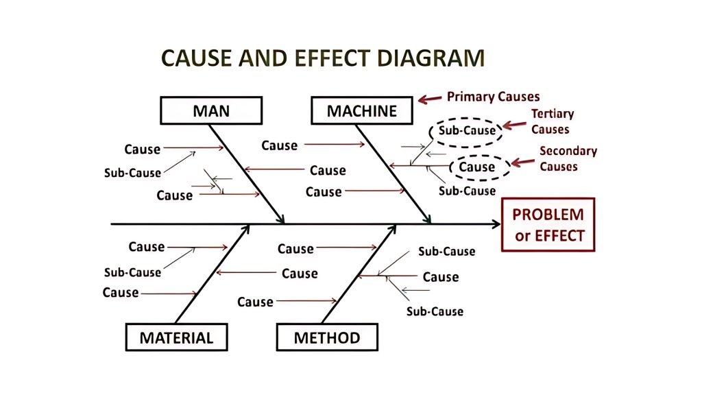
Cause and Effect Diagram also known as Fishbone Diagram helps in identifying the potential causes of an effect or a problem. In addition to sorting ideas in respective categories, it also helps in understanding the areas of opportunity through effective brainstorming. Fishbone training empowers you to identify the potential cause in the problem.
It is most useful when the root cause of a quality issue is unknown, allowing teams to structure their investigation by categorizing inputs like manpower, methods, machines, and materials. The tool supports collaborative analysis and is commonly applied in service delivery, manufacturing, supply chains, and process engineering where problem resolution demands a holistic view of interconnected factors.
Example: A quality assurance team in a pharmaceutical plant uses a fishbone diagram to analyze the root cause of inconsistent tablet weights. Through category-wise analysis, they discover that humidity in the raw material storage area is affecting tablet compression, leading to a procedural and infrastructure correction plan.
Control Chart
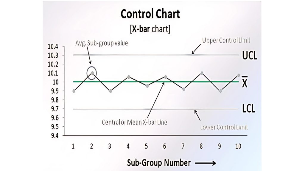
Control charts are used to study how the processes have changed over a period of time. Further, by comparing current data to historical control limits, one could lead to the conclusion about whether the process variation is consistent as in under control or unpredictable as in out of the control due to being affected by special causes of variation.
Control charts are particularly valuable in monitoring performance stability and identifying trends that may signal shifts or abnormalities in a process. They are widely used in Six Sigma, lean manufacturing, and process improvement programs to distinguish between normal variation and signals that require corrective action. This tool is ideal when evaluating time-bound data in areas like production quality, customer service response times, or delivery accuracy.
Example: A food processing unit monitors the weight of packaged products using a control chart. It notices that several recent entries are creeping above the upper control limit, indicating a need for calibration before regulatory weight thresholds are breached.
Pareto Chart

Pareto Chart is based on the 80/20 rule where it shows the significant factors that have the highest impact on the identified problem. This tool helps prioritize issues by highlighting the most frequent or impactful causes from a range of contributing factors. It is especially useful during the analysis phase of quality improvement projects when teams need to allocate resources effectively. Pareto Charts are commonly applied in complaint analysis, defect tracking, and operational efficiency reviews to drive focused action on areas that yield the highest benefit.
Example: A telecom company uses a Pareto chart to evaluate reasons for service downtime. It finds that 75% of outages are due to just two causes: fibre cuts and server overloads—prompting infrastructure upgrades in those areas.
Check Sheet
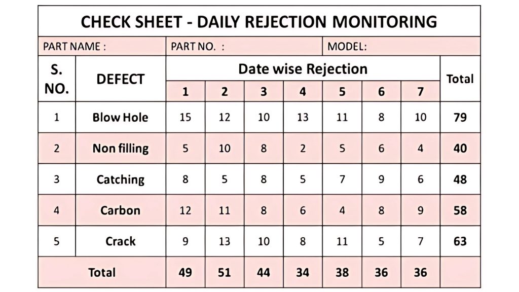
Check sheet is a structured process which helps to collect and analyzing data. It is an effective tool that can be for a variety of purposes. Often used as a data collection template, the check sheet helps operators and teams capture real-time information directly from the source. Its simplicity makes it ideal for frontline usage in production, maintenance, audits, and inspections. Whether tracking defects, documenting process steps, or recording equipment downtime, check sheets make trends easier to identify and prepare the data for further analysis.
Example: In a textile manufacturing unit, a quality inspector uses a pre-designed check sheet during an 8-hour shift to note every occurrence of fabric defects like misprints or loose threads. At the end of the week, the data reveals that nearly 65% of defects occurred in one section of the loom—prompting a focused maintenance review.
Need expert guidance on quality improvement and process control? Contact Us our experts Now!
Histogram
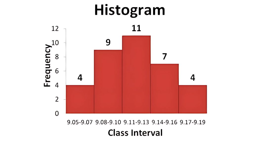
Histogram is commonly used a graph that shows the data and its frequency of distribution to help users identify each different value in a set of data occurs. Histograms help teams visualize whether process outputs are meeting expected performance standards or drifting outside desired ranges. They are especially effective when analyzing large volumes of continuous data, such as cycle times, service durations, or dimensional measurements. By revealing the shape and spread of data distribution, histograms support decision-making in quality control, product standardization, and process capability assessments.
Example: A manufacturing plant records the diameter of 500 metal rods produced in a day and creates a histogram. The graph shows that most values are slightly below the target range, indicating a systematic issue in the cutting machine’s calibration.
Scatter Diagram
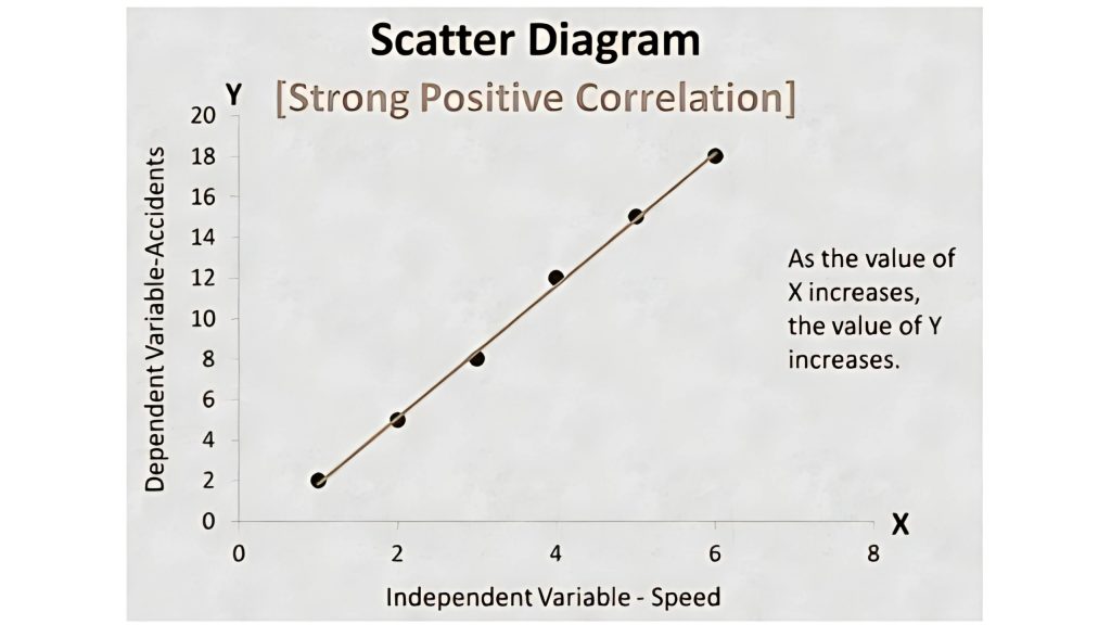
Scatter diagram shows the relationship between two important factors i.e. pairs of numerical data, one variable on each axis to demonstrate the relationship.
This tool is instrumental in verifying suspected correlations between two variables, such as input parameters and resulting output. By plotting real data pairs, teams can visually assess the strength and direction of relationships, which is crucial during root cause analysis or experimental studies. Scatter diagrams are frequently used in quality control to validate process assumptions, optimize parameters, and detect potential causal factors in performance deviations.
Example: A facility manager examines the link between machine operating hours and the number of breakdowns using a scatter diagram. The chart shows a clear upward trend, confirming that machines with longer hours are more prone to failure, justifying a revised maintenance schedule.
Stratification
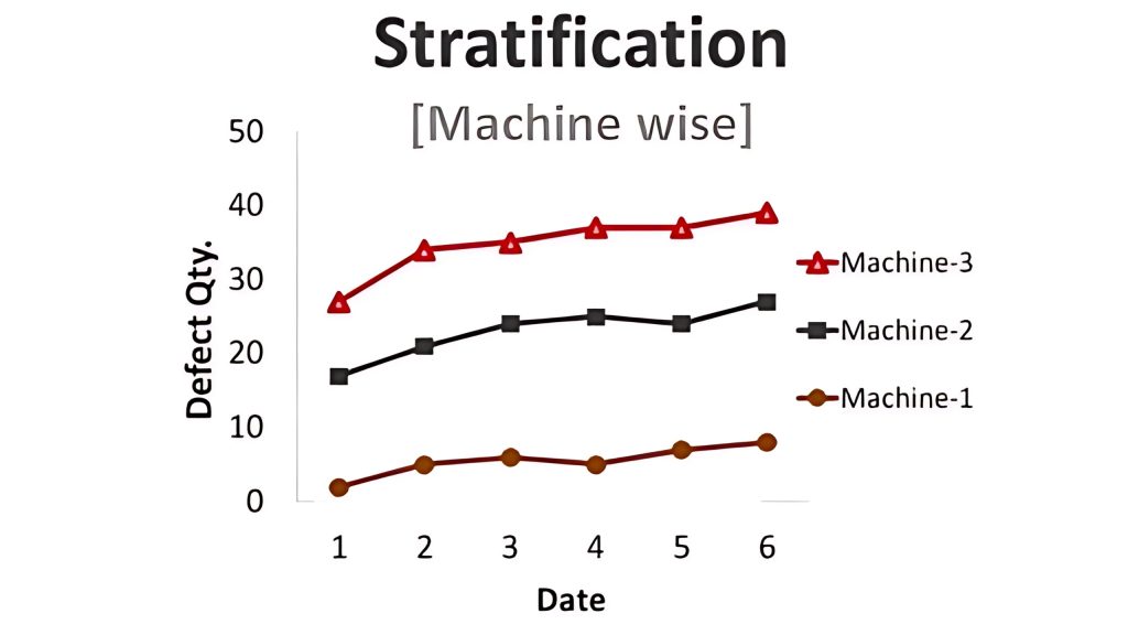
Stratification also known as a flow chart or run chart is a technique that separates the data gathered from a variety of sources so that patterns can be seen i.e., the path an entity has taken through a defined process. Utilizing the 7 QC tools in six sigma or quality management process helps in taking a systematic approach to identify and understand the risk, assess the risk, control fluctuation of product quality and accordingly provide solutions to avoid future defects.
It becomes especially valuable when dealing with mixed data from various departments, time frames, operators, or equipment. By organizing the data into meaningful categories before analysis, Stratification enables clearer comparison and avoids misleading conclusions. It is commonly used in audits, supplier evaluations, customer feedback analysis, and performance monitoring to trace underlying trends across segmented data sets.
Example: An electronics company investigates a rise in product rejections and stratifies the data by production shift. It reveals that 80% of the rejections occur during the night shift, leading to a focused training intervention for the night crew.
.
When should you use 7 QC Tools?
7 QC tools can be carried out during the quality management, quality improvement process, six sigma implementation processes or even the regular PDCA cycle for the quality purpose for enhanced quality management.
In the first phase of measuring and identifying, Fishbone Diagram also known as cause and effect diagram, Pareto Chart and Control Chart can be utilized. In the next phases of assessment and analysis, Scatter Diagram, Histogram and Checklist can be carried out. The Control Chart can be utilized consistent quality improvement.
.
Benefits of 7QC Tools
The 7 QC tools are structured and fundamental instruments that help businesses improve their management and production process for achieving enhanced product quality.
From assessing and examining the production process, identification of key challenges and problems to controlling the fluctuation present in the product quality and providing solutions for prevention of defects in future, the easy to understand and implement, 7 QC tools are very effective. Some of the major business benefits of 7 QC tools are listed below.
- Provides a more structured path for problem-solving and quality improvement
- Easy to understand as well as implement yet extremely effective
- A scientific and logical approach for problem-solving
- Follows the 80/20 rule i.e. gain 80% result with 20% efforts
- Improve the quality of product and services
- Helps in identifying and analyzing problems during the process
- Fishbone training aides in root cause analysis and problem-solving
- Encourages team spirit and fosters a healthy culture
- Identifies roots cause and solve it permanently
- Enhance customer experience and customer satisfaction
Based on the data-driven process and customer-centric approach, 7 QC tools implementation is one of the most effective processes that too in the shortest amount of time.
.
HOW 4C CAN HELP YOUR ORGANIZATION UNDERSTANDING 7QC TOOLS?
4C Consulting’s team of certified professionals brings hands-on expertise in deploying the 7 QC tools across diverse industries. With 80+ successful implementations and 120+ specialized training programs conducted, we have helped organizations integrate these tools into their quality systems with confidence and clarity. Our structured, data-driven approach has enabled clients to solve over 200 quality-related problems—reducing up to 80% of the cost of poor quality. From conducting root cause analysis and setting up effective control charts to enabling frontline teams with check sheets and Pareto prioritization, we ensure your organization is equipped for sustainable improvement.
Want to accelerate your quality management journey and reduce operational waste? Partner with 4C Consulting to unlock the full potential .
.
Frequently Asked Questions: 7 Quality Control Tools
.
What are the 7 QC Tools?
The 7 Quality Control Tools are most basic and easy to understand but most widely used for improvements, following are the 7qc tools;
- Cause and Effect Diagram
- Check Sheet
- Control Charts
- Histogram
- Pareto Chart
- Scatter Diagram
- Stratification
Why is it essential to understand the 7 QC tools?
You’ll be able to choose the best tool to assist you in resolving your issue or finding the answer to your query more quickly the more familiar you are with these common quality control tools. To find the root causes of your issue, use the Fishbone diagram. To differentiate between common and specific cause variation, a control chart is employed. To find a correlation or link between an X and Y variable, a scatter diagram is employed.
What is meant by Stratification?
A Stratification also known as a flow chart or run chart. It is a technique that separates the data gathered from a variety of sources so that patterns can be seen i.e., the path an entity has taken through a defined process.
Who created the 7QC Tools?
Kaoru Ishikawa formalized the Seven Basic Tools of Quality Control after being inspired by Deming’s lectures. He thought that by utilizing these seven tools, 90–95 percent of a company’s issues could be resolved.
What are the benefits of 7QC Tools?
Following are the benefits by using 7QC Tools;
- Improved quality of the product
- Helps in identifying and analyzing problems in the process
- Fishbone training aides in Kaizen (Continuous Improvement)
- Encourages teamwork
- Efficient way of solving potential problems
- Fishbone training aiming at determining root causes of problems
- Suggests area of improvement
- Enhances customer satisfaction
What are the different Quality Management Techniques?
Monitoring all processes and procedures required to maintain or reach a given standard of excellence in your firm is known as Quality Management. Following are some of the popular Quality Management Techniques;
- Quality Management Standards
- Design of Experiments (DOE)
- 7QC Tools
- Six Sigma
- Quality Circles
- Total Quality Management (TQM)
- Lean Manufacturing
What are the 7 steps of quality?
The 7 steps of quality refer to the key stages in a continuous quality improvement process. These steps typically include:
- Identify the problem or improvement area
- Gather relevant data
- Analyze root causes
- Develop possible solutions
- Implement chosen solution(s)
- Monitor results
- Standardize improvements and prevent recurrence
These steps are widely used in frameworks like PDCA (Plan-Do-Check-Act), Six Sigma’s DMAIC cycle, and ISO 9001 corrective action processes.
What is the new QC seven tools?
The New Seven QC Tools (also known as the 7 Management and Planning Tools) are more qualitative in nature and are used for strategic planning, problem-solving, and decision-making. They include:
- Affinity Diagram
- Interrelationship Diagram
- Tree Diagram
- Matrix Diagram
- Prioritization Matrix
- Process Decision Program Chart (PDPC)
- Activity Network Diagram
These tools are especially useful in project management and quality planning phases where complex relationships and goals need to be broken down and clarified.
What are the 7 tools of SPC (Statistical Process Control)?
The 7 QC Tools are the same as the core tools used in SPC to monitor and control process variation:
- Check Sheet
- Cause and Effect Diagram
- Histogram
- Pareto Chart
- Control Chart
- Scatter Diagram
- Stratification
SPC relies heavily on these tools to detect early signs of deviation, maintain process stability, and support data-driven decisions.
What are the 7 QC tools control chart?
The Control Chart is one of the 7 QC tools used in quality control to monitor process stability over time. It consists of:
- A center line (usually the mean),
- An upper control limit (UCL), and
- A lower control limit (LCL).
By plotting data points over time, the control chart helps identify whether a process is stable (in control) or if it’s showing unusual variation due to specific causes. It is widely used in manufacturing, services, and any environment where process consistency is critical.
What is a Flowchart in 7 QC Tools?
A flowchart is a powerful visual tool often used alongside the 7 QC tools to map out the sequence of steps in a process. Though not one of the original seven, it complements them by offering a clear, step-by-step view of how a task or operation flows—from start to finish. Flowcharts help teams identify bottlenecks, inefficiencies, rework loops, and error-prone steps, making them essential for process standardization and root cause analysis. In quality management, flowcharts are particularly effective during planning and improvement phases, enabling more structured and collaborative problem-solving.